Thursday 31 October 2013

Day 47: Can't Won't Stories by Lydia Davis


This book is ingenious. You are actually reading the book without knowing you are reading the book. Am I allowed to use contractions in this piece of writing? I feel like Lydia Davis will know. She will know, and then she will call me lazy. Please stand by as I attempt to refrain from the use of all contractions from this piece of work. And do not feel free to correct me if I am wrong.

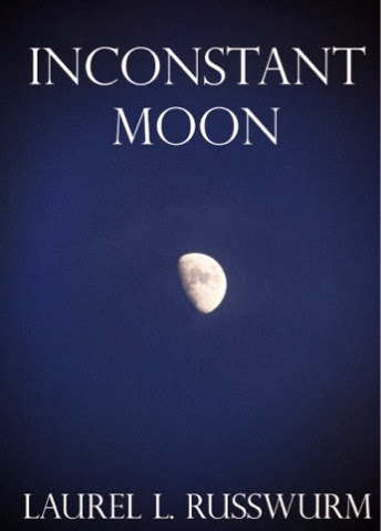
This book cover is worthy of a stop, pick up, turn over, and if not put back down on the shelf, then walk around the bookstore with. It makes you read (duh), think (unfortunately) and ponder its purchase (debating if this is good or bad).

Something that makes you do, without doing anything at all, within a mere few moments, should deserve some recognition. One can only imagine the prose inside. I need not say anything more.

Wednesday 30 October 2013

Day 46: Can't We Talk About Something More Pleasant by Roz Chast


This looks far too interesting for me not to read. Reason one is because memoirs are one of my favourite genre of reading and reason two is because Can't We Talk About Something More Pleasant? combines cartoons, text, and photographs to tell the story of an only child helping her elderly parents navigate the end of their lives. Surely there'll be a few interesting stories in here? To answer myself: yes. I was right. I couldn't help but looking inside. Just a lil. Here you can take a peek too: http://tinyurl.com/poq7j98.

Author Rosalind "Roz" Chastis is an American cartoonist and a staff cartoonist for The New Yorker. The cover gives exactly enough for you to know what to expect without giving all those special bits away. She details the conversations, moments, and memories from the that time with her parents. The quirkiness, sassy, and dead-funny cover also acts as a reminder to the sobering truths of the world. To be able to do that in one front cover deserves a helluva lot. 

Tuesday 29 October 2013

Day 45 The Shallows: What The Internet Is Doing To Our Brains by Nicholas Carr


I would read this book purely because it has a high chance of making me look smart and intelligent. A higher chance than the tatty copies of the Harry Potter series I lug from home-to-home are gonna give me.

Let's talk colour. Gray, an intermediate colour between black and white, an achromatic, literally without colour. If that doesn't tell you much about my personality then, well, please read on. Gray is the colour that can be most commonly associated with boredom, uncertainty, indifference, and dreariness. And interestingly only a meagre one percent of the participants, from wherever I got this information from, chose it as their favourite colour. Is gray a negative metaphor for the internet in this case?

Ok so let's flip it. What about the gray power-suit? The industrial gray? The the tonal subtlety of natural stone, gray? The practical, simple and reliable, gray? The neutral, calm and soothing, gray? The gray that I have come to know and love! Or is that gravy? 

I feel like I have gone off topic here. So to reel it back in, I must say, Nicholas Carr must be working with colour psychologists to create two schools of thought here. Internet = bad; internet = good. If we were to read the colour blue, in contrast to it's gray counterpart, one might sway towards internet = bad; the shallows = good. What on earth is the shallows?

I need to read this book ASAP to see what all the fuss is about. 


Monday 28 October 2013

Day 44: My First Little Boob Job by Bob Staak


This is really cute! I stumbled across these books on an advanced Google search. This illustrated series, "Satire, Humor and Visual Parody of Classic Children’s Books From the 1940s Through 1960s," are the classic children’s books that have been hijacked by illustrator Bob Staak. Described as subversive, disturbed, twisted, but full of humor! these book covers definitely made me look twice. I had to have them on here. I suppose it's because they're just SO wrong. And yet I can't help myself from laughing uncontrollably. At every single image. I'm currently favouriting the site so I can send the link in an appropriate work email to my colleagues tomorrow. This probably makes me look bad. Upon scrolling through this series I found I had actually stumbled upon a cover that I am all too familiar with! Check it: http://tinyurl.com/qebev4z. Once again we find ourselves questioning my moral compass. Let me know if you laughed as much as I did.

Sunday 27 October 2013

Day 43: Into The Child by Shannon Bradley-Colleary


This title packs a punch. Probably because I'm 24 years old and nowhere near having children. Is that sad? I have friends having kids and I'm literally over here watching Will & Grace re-runs in bed. What.

The words, "child," "gestational," and "wilderness," in the same sentence doesn't really bring it home for me. And we all know 40 weeks means 9 months. Let's not try and get tricky about it. Let's not make the pregnant reader think more than they need to. Isn't being pregnant enough for you.

I do appreciate the difference in cover than one would usually see when browsing traditional pregnancy-themed self-help books. It's definitely a step-up from your traditional cartoon drawn Father, Mother, Baby triangle. Although, isn't it a bit offensive. She's pregnant and wearing a mask, like she needs to hide it. Just because pregnancy turns your cheerful, delightful and even-tempered partner into the devil's right-hand man, doesn't mean we need to go about advertising it. Right? Or do we? Do I need to trick someone into having a child with me? Is that how this works?

Please don't send me hate mail about how you think I'm unappreciative of pregnancy, and pregnant woman, and the miracle of childbirth. I get it. I hope to look back at this and laugh at how stupid I was.

I'm flattering myself in the above comment. I only have one follower.

Saturday 26 October 2013

Day 42: The Chronicles of Thomas Covenant the Unbeliever: Asshole Leper Hero by Stephen R. Donaldson


I know that all I'm supposed to be doing is judging the cover of books and not what's inside them, but damn son! The title has got me like oh my god i'm so in love I've found you finally you make me wanna go oh oh... (Usher ft. Will.I.Am., 2010). Especially since I googled the premise and I really like what I see. Oops. What is even better is coming across the comments people leave in the comment section, providing there is one. And I've stumbled across some beauties:

"This series is somewhat infamous: it's widely regarded as brilliant (which it is), it's widely considered depressing (which it can be), the hero is often unappealing (which is the point), and many find the trilogy at least 25% too long (which is true). Plus, the follow-on trilogy tells almost the same story with almost the same point to it." (Thanks Seth from San Fran.)

Lol. And:

"...Thomas Covenant is the world's most miserable, gloomy, wretched, irritating, hateful, abhorrent, despicable, contemptible, disheartening, forlorn, self pitying excuse for a (make believe) human being it's ever been my misfortune to read about. (view spoiler) I was pretty much done with him. I read this trilogy with a group of friends so finished them. I'm more careful about what I commit to in group reads now. Do you get the idea? I HATE these books. if you don't, well good for you. But you need a good, really good attitude to read this tomb errr, I mean tome, consisting of Thomas Covenant's self centered misery. Maybe you could consider a therapist????? I reviewed this a while back, but I want to update it. I want to include a quote from Dorothy Parker I've used before: "This is not a novel to be tossed aside lightly. It should be thrown with great force." (Good day, Mike the Paladin)

And this is probably the best:

"THE FOLLOWING CONTAINS SPOILAGE UP THE YING-YANG." (Cheers Szplug!)

That's not a review but I like it and I hope to one day use it.

Friday 25 October 2013

Day 41: Quilt in a Day: Still Stripping After 25 Years by Eleanor Burns


"Oh my days," "What the shit," For God's sake," "Oh Lord," "Shit the bed," "I die," are all of the expressions I have indeed exclaimed, out loud, when I saw this book cover. I also half giggled and half winced at the same time. Half giggling and half wincing is hard and also ugly, I recommend not doing this at home kids, try it some time.

Eleanor, what were you thinking? You were not thinking! I mean kudos to getting a book out there. But a few things should have been re-considered well before its publishing date. A few questions have conveniently popped straight to mind. And even more conveniently a few answers have also popped straight to mind. In no particular order:


  1. What's our wardrobe options? We'll consider option A, B, and C but we'll scrap those and take you off the cover. 
  2. Do you want to go with this title? Let me answer this with a question: do you want people to think you're a veteran stripper?
Oh wow. I have nothing more to say. That can be in a public forum anyway. 

Thursday 24 October 2013

Day 40: Bukowski for Kids by Black Sparrow Press


I love this cover! Half of the reason why is because I am attracted to the work of Charles Bukowski, the other half is because look at their cute little faces. And the other half is because I have read Green Eggs and Ham on Rye. 

Little boys and little girls should probably not have their chubby, wubby, grubby little hands on anything Charles Bukowski has. Reactions, as illustrated above, are guaranteed. I didn't even know there was such a thing as Bukowski for Kids, wait are we sure it is actually a thing? Dis gotta be a joke?

I have come up with a series of titles that Bukowski could have worked with in his children's series. In alphabetical order: 

  1. Cloudy With a Chance of Rum 
  2. Green Eggs and Hash on Rye
  3. The Very Horny Caterpillar
  4. Where the Rash Things Are

I did a judge of Green Eggs and Ham on Rye a little while back. Check it: http://tinyurl.com/metfwu8.


Wednesday 23 October 2013

Day 39: The Curious Case of Benjamin Button by F. Scott Fitzgerald


My memory escapes me as to why I chose this book cover. I will find out. Please hold the line, caller.

Ok so I went on a hunt, not a treasure one unfortunately, but a hunt nevertheless and found this. (Who even knows what I was looking for). Please see: http://tinyurl.com/n46bhz7. I think this may be the original cover. Help? And again my memory has failed me as to why I didn't indeed choose the original over the above. If I were to hazard a guess I would say it's because of the mint green background. Damn you pastel colours. You beautiful, beautiful pastel colours.

That is all I will say about the cover because I would like to move onto more pressing issues. Those being Brad Pitt's face. See: http://tinyurl.com/d96jdtm

Originally published in a collection of short stories in 1922, The Curious Case of Benjamin Button, is now an accomplished Box Office hit! High chances it's because of Brad Pitt's beautifully symmetrical face.

Have I mentioned Brad Pitt yet? Why didn't they stick his face on this beautiful pastel background? I fail to see a reason as to why.

Cate Blanchett was in this movie as well, by the way.


Tuesday 22 October 2013

Day 38: Russh Magazine


So it looks like I'm continuing with the creepy inclusion of my body parts in the cover shots. Whatever.

Russh is an Australian magazine publication and from what I can gather this is what they're all about:

"RUSSH is an independent fashion magazine showcasing innovators in fashion, art, music and film through originally produced editorial and photography. RUSSH reflects the way intelligent women approach fashion and beauty to create their own distinctive style. RUSSH is Australian at heart, international in mindset."

Ok so I stole all that from the website. Whatever. They're a fashion, high fashion (said in some sort of accent) magazine. What else do you need to know. 

I'm biased towards these covers. Gimme sass, style and sophistication any day. I'm a real sucker for these magazines with their thick GSM pages, glossy images, and clothes I can only dream of owning. From memory I needed to take out a personal loan just to even buy this magazine. 

Alas, I'll leave you with this pearl of wisdom. Dreams are free. 


Monday 21 October 2013

Day 37: Reflections in a Golden Eye by Carson McCullers


Author says: I must firstly apologise for my rather plump fingers distracting from the actual task at hand. I'm sorry.

Upon taking to google, to well google this book in an attempt to further my knowledge of it, I discovered it was first published in 1970 as a paperback. This very book my sausage roll fingers are touching is actually an original.

And my, this book cover is really something else isn't it. Amongst the themes of sexuality, violence and voyeurism that jump out at me, it was (most importantly?) only 25c!

Ok so I may be demonstrating very poor moral judgement by valuing something on its dollar worth but srsly guise, what costs 25c these days? Certainly not too many things spring to mind.

Gone are the days of catching a bus for 50c, buying a 5c mixed bag of lollies, and getting into the public pool for just a buck. And the price of books. Like, I just want a book. I don't want a book made from the paper of trees born into the Caribbean that grew up in the South of France only listening to classical music that bathed in the tears of Jesus. I don't want to have to convert to the kindle, wah.

I love the feel of a physical book. I don't know if I can covert. Pro's and con's welcome.

Sunday 20 October 2013

Day 36: Fast Food Nation by Eric Schlosser


Three quid for a classic? Now that's what I'm talking about. However it'd still be cheaper than buying from New Zealand with the exchange rate and shipping. Damn.

I love these little Penguin books! They are simply delightful. It would be great to have a collection of these books in my library. See https://einkeread.wordpress.com/2012/09/23/for-those-who-love-paperback-books-the-complete-penguin-classics-collection/ It would also be great to have a library. See http://www.onekindesign.com/2013/08/02/50-jaw-dropping-home-library-design-ideas/

I'm attracted to the simplicity of these books. I love the way they say it best, when they say nothing at all. (Keating, Ronan, 1999).

Why is simplcity so attractive to me? Stumbling upon a Leonardo da Vinci sums it up quite nicely. I take that back I searched for quotes, one does not just stumble upon da Vinci am I right?

"Simplicity is the ultimate sophistication."

Plus I love the colour teal! Is that teal? I love it. 

Saturday 19 October 2013

Day 35: Start With Why by Simon Sinek


When I first saw this book cover I really liked it! It's bold, confident, and brilliant. And what's even better is that, from my initial thoughts, I had no idea what it was about! Alas, I have now realised that it's a leadership how-to book. Probably a really boring one too. So although this cover is actually quite deceptive. So nice work Sinek you got my attention then you threw it away. And even if it's not boring and it's as good as its cover, oh well, it's calling judging a book by its cover not not-judging a book by its cover.

Sinek should have gotten rid of all the white space, all the extra text, subheading, and his name and just had a book half the size with the title Start With Why exactly the same. Shit that would have been cool. I would see that book and think about reading it at the very least. I think it's the metallic red. I don't know what certain circles think of it, but I think it's pretty damn cool.

Friday 18 October 2013

Day 34: Popular Science's 1954 Auto Show by Tom Riddle


This is SUCH a 50's book cover. And by a 50's book cover I mean such a little boys book cover. Which probably explains why my boss bought it. He's a man. And by man I mean a 10-year-old in an adults bod. Nevertheless I think this is a cool book cover, I'd like to have a book like this in my (teeny weeny) book collection. It'd be a nicely, diverse addition to the family. Buuuut I don't actually know if I would read it, oops. 

It's a kinda one of those books that I like the look of..and that's it. Haha. I am so deep. I'd also probably flick through it every now and then, you know, just to feel better about owning a book I wouldn't actually read. The book pages would have a nice feel to it though. Slightly browned and crispy, the kind of pages that you know have history. 

Maybe I could find interesting facts inside that I could use to show-off about. 

Thursday 17 October 2013

Day 33: Voices of the First Day: Awakening the Aboriginal Dream by Robert Lawlor


This is a cool book cover! It does, however, give everything away. I can tell this is an Indigenous Aboriginal type book from one glance really. And although I'm not saying that this is a bad thing, there are other things that I would rather read about. But, if this is a picture book, I'm in. Well, I'd be in for about ten minutes and a quick flick through of the pages and that'd be it.

The saying, "A picture paints a thousand words," would be appropriate in this case. I can only imagine the intricacy of the images. The book would definitely not do it justice. And can you imagine the colours? Where does one start with an image like this.

This probably isn't even a picture book. Why am I still talking.

Wednesday 16 October 2013

Day 32: A Taste of the Unexpected by Roald Dahl


What I really like about this book cover is the simplistic, yet busy feast of illustration. Although they are all different in their own right, I really enjoy the way that they all come together on this one cover. Who know's what I'm really saying though. I don't. I'm scrambling.

There's something about illustration that I really enjoy. I put it down to the fact that it's because I cannot draw to save my life. True story. I even struggle with stick men, as simple as they may seem. So really I admire anyone with the skills of art. Art in the broadest of terms.

Buuuut I do have one suggestion towards the improvement of the cover. It could be nicer if it wasn't such a common blue. Right? It seems like the artist simply drew it on a napkin with a blue pen from the bottom of his bag and pasted it to the cover of this book. Is that potentially the purpose of this cover? Well if it is then yeah I got it.

I like Roald Dahl though. So, you know. I could read this.

Tuesday 15 October 2013

Day 31: Hark A Vagrant by Kate Beaton


Aha! This book cover is pretty damn hilarious. Don't you think? The expression on the face of the soldier (?) is classic vagrant. It reminds me of the little kids that wear the same cowboy/spiderman/superman/fairy outfit to school for six months because their parents gave in on the second week. Cheeky!

But the book looks a bit boring. What's on the inside? I kinda feel like it's just pages and pages of that same pasty yellow used on the background of this cover. Or that there'd be no images throughout the rest of the book and just big, random words pasted everywhere. Like, "yellow" and "blah" and "yah" or some shit.

But it might be pretty interesting, if the vagrant in question did some interesting shit. Like, if he went on an adventure. And the adventure was interesting. So really what I'm trying to say is what this needs is more of a background. Rather than have that pooey yellow it would be nice to have a background where shit was getting done. He could be on a pirate ship, or in a jungle, on a beach, or in a bull ring or you know anything apart from that damn yellaaa!


Monday 14 October 2013

Day 30: Ireland Coarse Fishing by One Shilling


Who is this One Shilling character?!!!!11111one

I would like to put this book cover in my collection of great book covers. When I start one, that is. Green is my favourite colour, and fish are one of my favourite animals, not to mention things to look at. I would also like to put the book cover on my wall. Or perhaps as a background to my fish tank. When I get one, that is.

This simplistic book cover is great. It doesn't look anything typical of a "how-to" book cover. How do I know it's a "how-to" book? Ok, I googled it. I needed something for inspiration. I typed in "fishing book cover," just off the top of my head and this is the best thing that came up. Yes, I know, I am brilliant. Because there is more to the story! Look at all these other gems I found. It's a set!


Sunday 13 October 2013

Day 29: Leadership, Management and the Five Essentials for Success by Rick Joyner


First and foremost I would like to thank the publishing company for helping this book go out of production. You have done the world, Rick, and myself a great favour. Yes! This book is out of production! And by no means is that an invitation to go out and buy a copy because you can resell it for  a lot of dolla dollaz in a few years. This book has gotta be out of production because the only reason you'd open it is because you mistook it for something more interesting, like a banana. Or how to tie a toga.

I do, however, would like to know what the Five Essentials for Success are. But that's only if they are not attached to the aforementioned Leadership, Management and if they actually worked. Otherwise I would just google them. Ok, I will.

The five essentials of music career success?

1. Hone your talent and realise there is a place for you. (My talent? Never heard of it)
2. Connect with as many people as you can because relationships drive music careers more that anything else, even talent.
3. Accept the new powers in your corner and take responsibility for creating your own success. (Like, superpowers?)
4. Understand that every business is becoming a "music business" and so musical opportunities are multiplying. (Even the medical profession?)
5. Prepare to be versatile and to wear several hats initially, until your "brand" is established. (Even the sorting hat?)
That advice is about as boring as this front cover.

Saturday 12 October 2013

Day 28: Grafika. Pocket Notebook.


This one is a slightly different cover judgement today. It is, as you can hopefully obviously see, is a notebook. The type of notebook you write in. Aahhhh I'm getting inspiration from everywhere. A book cover is a book cover is a book cover. Ya dig?

This book cover is fancy schmancy. It must be the type of book cover for someone in the creative industry. Or anyone whose anyone who uses notebooks. I would use this notebook. I would see this book cover and literally open it up and see what's inside.

What colour are the pages? What colour are the lines? How big are the line spaces? What should I write in here? Is there are place to write my name? Does each page let you write the date up the top? Should I use black pen or blue pen? There are so many questions that all of the inside of this book can answer.

The colours work so nicely together. Again, the yellow is a nice touch. Because yellow is a nice colour.

Friday 11 October 2013

Day 27: More Than This by Patrick Ness


 This book cover is pretty freaking cool. It's user-friendly and yellow. I like the colour yellow. Apparently yellow is the colour of the mind and the intellect. That's probably why I like it. Boom. Also they say that when you're studying if you use a black pen on a yellow pad when writing your notes you'll remember more. Perhaps this is ol' Nessy's trick. Don't forget, More Than This for your next book purchase.

However, this whole front cover is a bit more than just a simple trick. Because its a bit quirky with the whole door concept, he's already got you past the front cover! Even if it is just the second page it still bloody counts. He's done pretty well in comparison to pretty much a lot of other book cover arteeests.

The front front cover is a bit hard to swallow. Is it a grid? It's almost hurting my eyes looking at it. Perhaps it is a million noughts and crosses formats. Even better. The only thing that hurts even more is the sticker on the front. No no no to all the stickers on the front. You cannot "good-work" sticker your own work. Although I do it all the time.


Thursday 10 October 2013

Day 26: The Leadership Challenge by James Kouzes & Barry Posner


Well, well, well this is a leadership book of different sorts. Normally these books are on the bottom shelf of any established anything, all covered in dust, with brown pages, and an odd sort of aroma that can only be found under the house. This one, however, looks reasonably smart, and reeeaaaasonably cool (?) if I was forced to say admit it. Ok, I admit it.

What I don't like about this book is the two covers. The hard cover, and the transparent tracing paper that's over the top. You can NEVER get in a comfortable position with those books. Plus the smudges on this type of paper are so hard to clean off. But I can kinda get that it's a look, like the sneakers and jeans look. It looks good on the shelf but it is not feasibly practical, not like the sneakers and jeans look though, sneakers are just so damn comfy!

This book looks like it does what it says it's going to do. It's up to its fifth edition. And its 25th anniversary. Interesting. I still wouldn't read this book.

Wednesday 9 October 2013

Day 25: Inconstant Moon by Laurel L. Russwurm


Is the word Inconstant like, you know, real? It doesn't really roll off my tongue like I feel it should upon first glance. I really enjoy this book cover. It reminds me of Celine Dion in hit song, "The Power of Love." Whose with me on that one? Anybody? The blue, for some unbeknown reason, transports me back to the '80s. A time when I actually wasn't alive. I'm still allowed to say that. Because I just did. And because I was an avid Celine Dion fanboy. 

This book cover speaks to me because it's naht screaming at me. It's just, you know, nice. "You say it best when you say nothing at all." I could hang this book cover on my wall and be happy with it. But perhaps it could be better with a different blue. To make it less... Old school. Something more refined maybe. 

Also Laurel is that a boy or a gurl? And what is a Russworm? Should we be concerned...


Tuesday 8 October 2013

Day 24: Doctor Ted by Andrea Beaty & Pascal Lemaitre


This book cover is absolutely adorable. Teddy bears are adorable. Teddy bears in doctors suits are adorable. They're soft, cuddly, and affectionate. And they don't let up. 

Doctor Ted looks distinguished of sorts. In the animal kingdom I mean. However I wouldn't want him writing my prescriptions. I'd hang out with him though fo sho. I imagine he has a deep, profound voice. He doesn't talk much.
But when he talks he talks with meaning and integrity. And warmth. He talks and you feel warm inside. 

I like the colours used in this cover. Solid, simple colours. Colours from the average crayon box. Perhaps they should have let the target audience, teeny weeny kids, colour in the book cover. That would have been a bit adorable. Stupid but adorable. 

Also Doctor Ted doesn't talk much remember. He doesn't need a phone. 

Monday 7 October 2013

Day 23: The Paper Bride by Esther K. Smith


Reow, this doesn't look really saucy. This is kind of an annoying book cover actually. Firstly because I suck at DIY and secondly because why would you want to DIY your wedding unless you're a dressmaker, or baker, or a musician. Ya know? Wedding DIY doesn't sound like my type of anything.

I'm am having a thoughtless kind of day. I will write what I think about this book in a haiku for you:

I like the yellow 
used on the cover and 
that's about it. 

Fin.


Sunday 6 October 2013

Day 22: Dark Shadows Falling by Joe Simpson


Sorry guys, and terribly sorry, Joe (fellow hundred-dayer) but today's book cover is a bit of a yawn. Boo-ring. This looks like a book that's in the "on-sale" shelf, all the time. Hence, the Look Inside concept. Unless that's part of the title. Look Inside Dark Shadows Falling by Joe Simpson. That sounds nothing like a book, but more of a Chinese proverb, by Hue Ximpzon. 

Look Inside Dark Shadows Falling was coined by the great 1994 live-action Street Fighter character Chun-Li Zang. During the famous fight with arch-nemesis Zangief, at the Festival of the Old Temple, against the backdrop of South Korea, Chung-Li was on her last life as Zangief threw the last ten moves.

Her bloodied face looked up towards the sky as it quickly darkened. As the dark raindrops fell slowly onto her forehead as she whispered to no one in-particular, "Look Inside Dark Shadows Falling." A bright light suddenly appeared over her limp body as her eyes came to a close. As the temple shook all around her and Zangief started to panic, her body rose mid-air and came to a hovering stop.

A loud voice bellowed, seemingly in response, "Touch the void!" And with that she disappeared. Lost forever to only be remembered through tales of cultural legend. The meaning being that if you look inside dark shadows, no matter where they may be, and what situation you are in, you will always rise above if you look up.

Alas, this is not the book cover for that story.


Saturday 5 October 2013

Day 21: Puppet: An Essay on Uncanny Life by Kenneth Gross


Today for inspiration I did one of my favourite things to do. Oh yeah I did. I chose a describing word and then put it before, "book" and search-engined it. I chose the word "gross." Yes, that old chestnut. This immediately came up and immediately struck at the judge-strings.

This is one hell of a creepy book cover. So simple, so clean, yet so creepy. And no it's not because of Kenneth's unfortunate last name. Poor chap. It's because of the werd Puppet. And because it's on sticks. And because it's somehow made to look shady. And because puppets are so damn shady! Or is that clowns? No, it's both.

The connotations that I have of puppets include the words: manipulative, hollow, and soulless. That does not make for an ideal anything. Although if this is a horror story, which I would not liken with the title (uncanny is a kewl werd), it would fit. Because you know what, this book cover looks like a ghosty story you'd tell on a school camp in the tents before bed time.

But what is, an Essay on an Uncanny Life, all about? A puppet's autobiography? What a kick in the arse.


Friday 4 October 2013

Day 20: Pug Hill by Alison Pace


Read any good books lately? I'll be the judge of that - was what I google searched for today's inspiration. And some inspiration it was. This can go straight back to the "Mum's drinking club with a reading problem" book club.

There are too many words all over this page. I can't keep my eyes straight, and no I don't have a problem. Alison Pace has not even capitalised the first letters of her name. What is she? Obviously not a proper noun. Do author's feel they have to put all of the praise they've ever received over their book covers so people feel the need to read it? How facetious.*

However, she's author of Andy Warhol had a Girlfriend. Now that, that is the best part of this book cover. Although anything with ...had a Girlfriend after it would interest me. Oh what is my lyf lyk. (Yes I have said that before you robots.)

Pugs are cute doe.

*Don't care, this is my favourite word.

Thursday 3 October 2013

Day 19: The Amazing Adventures of Kavalier & Clay by Michael Chabon


I want to open this book and see not words but men in suits. Is that so much to ask? If this is going to be your book cover then it definitely isn't a hard request to live up to. It would, in actual fact, be amazing - as the title suggests.

Who are the mysterious Kavalier & Clay characters? They sound like stars from hit daytime series The Bold and the Beautiful, not to mention that their names work perfectly together. Kavalier is the leggy blonde with the diamond encrusted heritage, and Clay is the tall, dark glass of refreshing water that breezed through Malibu Heights as welcoming to Kavalier as a new Chanel handbag. They suit each other perfectly.

As does the blue used in the background of this image. Cool, calm, and collected - just like Clay. 

The only element that ruins this book cover, and stops my imagination from running wild, is Michael's last name. Chabon, is that a breed of baboon? The Chabon Baboon resides in the deepest, darkest terrain of South America...as the largest prey known to predators. It's know for it's fleshy, fatty meat, slow prance, and stupidity. Tigers like to eat The Chabon for breakfast.


Wednesday 2 October 2013

Day 18: David & Goliath: Underdogs, Misfits and the Art of BattlingGiants by Malcolm Gladwell


This book cover is so simply great. And what's better this is an exclusive judgement. This book isn't even on shelves yet! Yeahhh I got my ins. (Thanks Marky G)

The two dimensional colour palette is perfect. Everybody loves black and red. And everybody loves black and red teamed up. And everybody loves black and red in this paintbrush font.

The title of this book speaks something. Underdogs, Misfits and the Art of Battling Giants. It's gotta be about the battle of the underdog right? I don't know if that's really a good thing though. I'm thinking of a word starting with "c" and ending with "liche."

But the cover is so pretty that I would look past the title and the fact that this is a "how to" and maybe read it? 


Tuesday 1 October 2013

Day 17: Greater by Steven Furtick


When I first saw this book cover I thought it read, "Great ER." Now that would be one hell of a book. Alas no, it simply reads as Greater. Still it's clever how they got my mind to play tricks on me like that. What I like about this book cover is it's lines and it's colour palette.

I've said it before (re: Day 16) and I will say it again: I like the colour orange. And all the colours that surround it. Not because it is the colour of the metro man's S/S '13 wardrobe.

I did a little digging.

"In Europe and America, orange is commonly associated with amusement, the unconventional, extroverts, fire, activity, danger, taste and aroma, the autumn season, and Protestantism. In Asia, it is an important symbolic colour of Buddhism and Hinduism."

Well, nothing there mentions that orange reminds me of citrus and summer (who does autumn even?) And those are the two selling points for me. Yum.

I like lines. And I like these lines. They're straight (key component) and some of them are orange (citrusy). The other point I'd like to make is that the words line up to the left. I like it when sentences do that.

Special thanks to the bro Kaylee, part-time hand and face glamour mod.